Overview
Flok22, is a social meet-up app that launched in 2021. Flok22 helps people to make friends and grow their network in real-time situations. Attempting to combat excessive planning, no-shows, ghosting, and catfishing, Flok22 encourages people to make authentic connections with likeminded individals.
Role
Responsibilities
Tools
Year
UX/ UI Designer
App Redesign
Figma, FigJam
2023
🚨
Problem
Flok22’s app was struggling to increase adoption and engagement due to their confusing layout, unclear safety measures, and user interfaced that didn’t inspire trust.
🎯
Solution
To redesign the app with a focus on safety, clarity, and usability, creating a modern, credible, and user-friendly platform for meaningful real-world connections.
🔄
Process
To understand user needs and barriers, I conducted a mixed-methods study that included stakeholder interviews, surveys, user interviews, a competitive analysis, heuristic evaluation of the existing app, affinity mapping, personas and journey maps. Developing sketches, low-fi to hi-fi designs, testing and iterating based on usbalitly test results.implementing and iterating based on stakeholder feedback.
01 Understanding
To adequately understand Flok22’s business goals and the users expectations, I conducted stakeholder interviews, surveys, and studied competitors to learn what people wanted and needed. This information allowed me to progress with an informed design to drive overall adoption and engagement of the app.
Stakeholder Alignment
I began with stakeholder interviews to define business objectives. Three important items emerged:
🖇️
Facilitating authentic connections is at the heart of Flok22’s mission
🛡️
Safety of users is a top priority, needing clear and easy reporting and blocking features
🚧
Adoption challenges were understood to be tied to usability issues
Research Goals
Guided by these three priorities, I wrote research goals that kept the project focused and aligned with stakeholder objectives.
🔗
Understand what motivates users to connect
🚫
Identify barriers to trust and adoption within social connection apps
🔐
Udnerstand expectations around usability and safety
Research Methods
02 Analysis
Affinity Mapping & Insights
Following the research I synthesised the data to identify pain points and uncovered actionable insights that helped to inform Flok22’s personas.
😵💫
Users need motivation and prompts to overcome anxiety about meeting new people
🎒
People want to go on more adventures with likeminded individuals
🔒
People want to feel as though they're safe and protected when using meet-up apps
Personas
03 Design
Low-Fi
I sketched out some solutions to current concepts that needed improving and some new designs that aligned with the user and stakeholder needs.
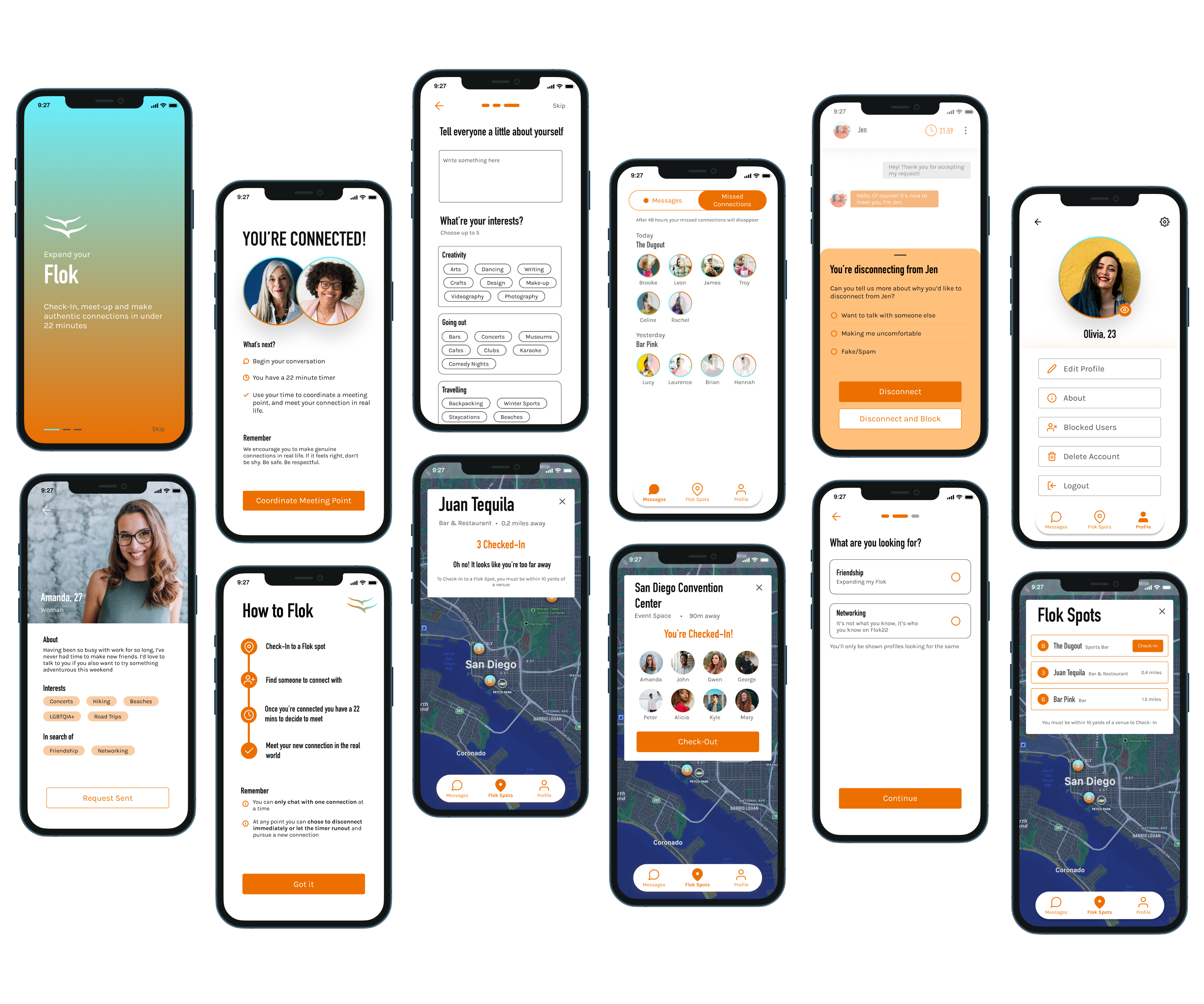
Redesigned Experiences
Profile Set-Up
While the initial onboarding process was quick, it lacked detailed explanations and specificity. In the redesign, I provided clear descriptions, offering filtering options, and presenting users with relevant information about the app and its usage at various stages.
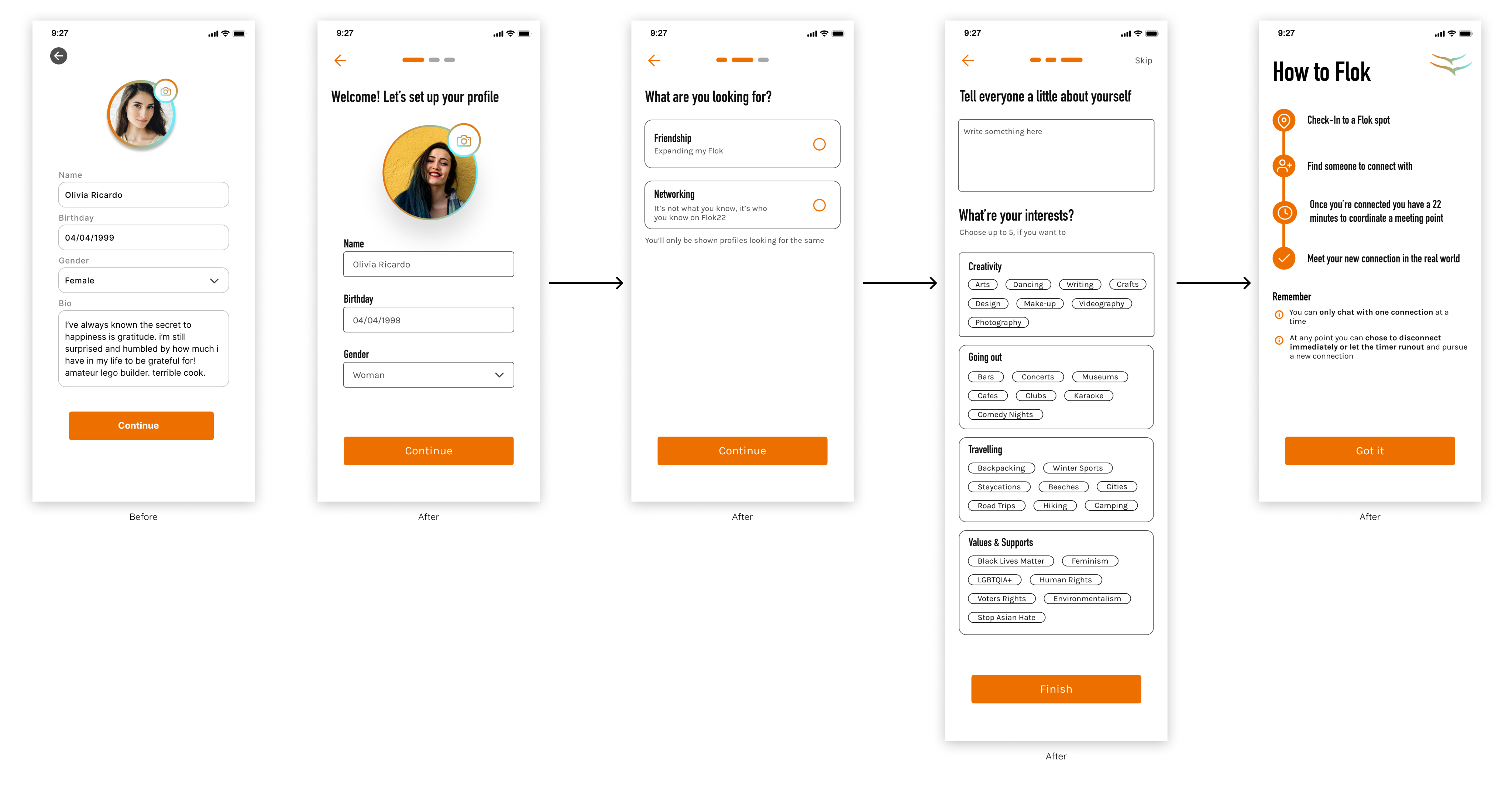
Homepage
- Added a Filter icon for effortless customisation of preferences
- Included a List icon for quick access to Flok Spots
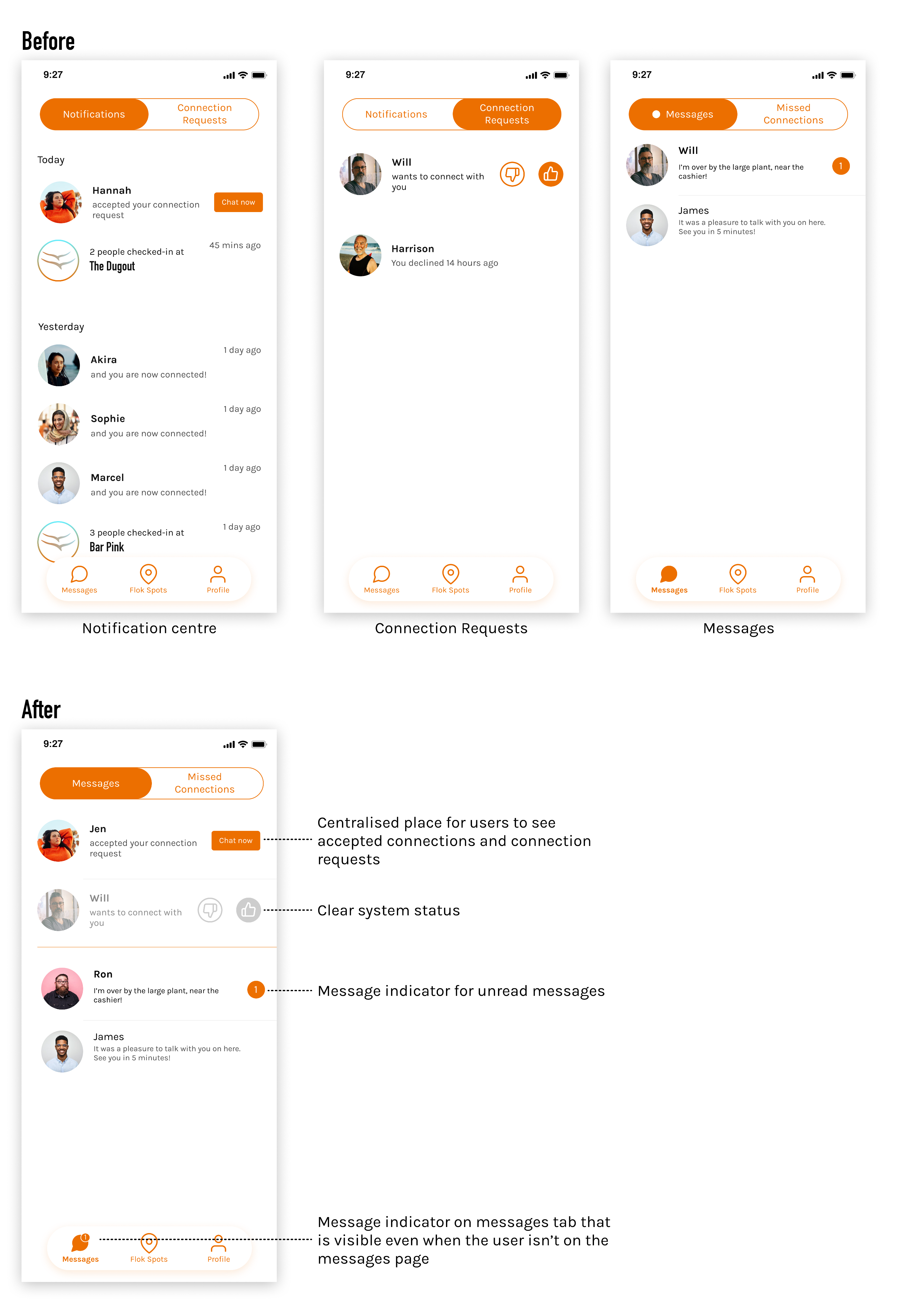
- Integrated a Notification center to support convenient navigation
- Redesigned the navigation bar to align with the brand’s aesthetics and maintain a cohesive visual identity
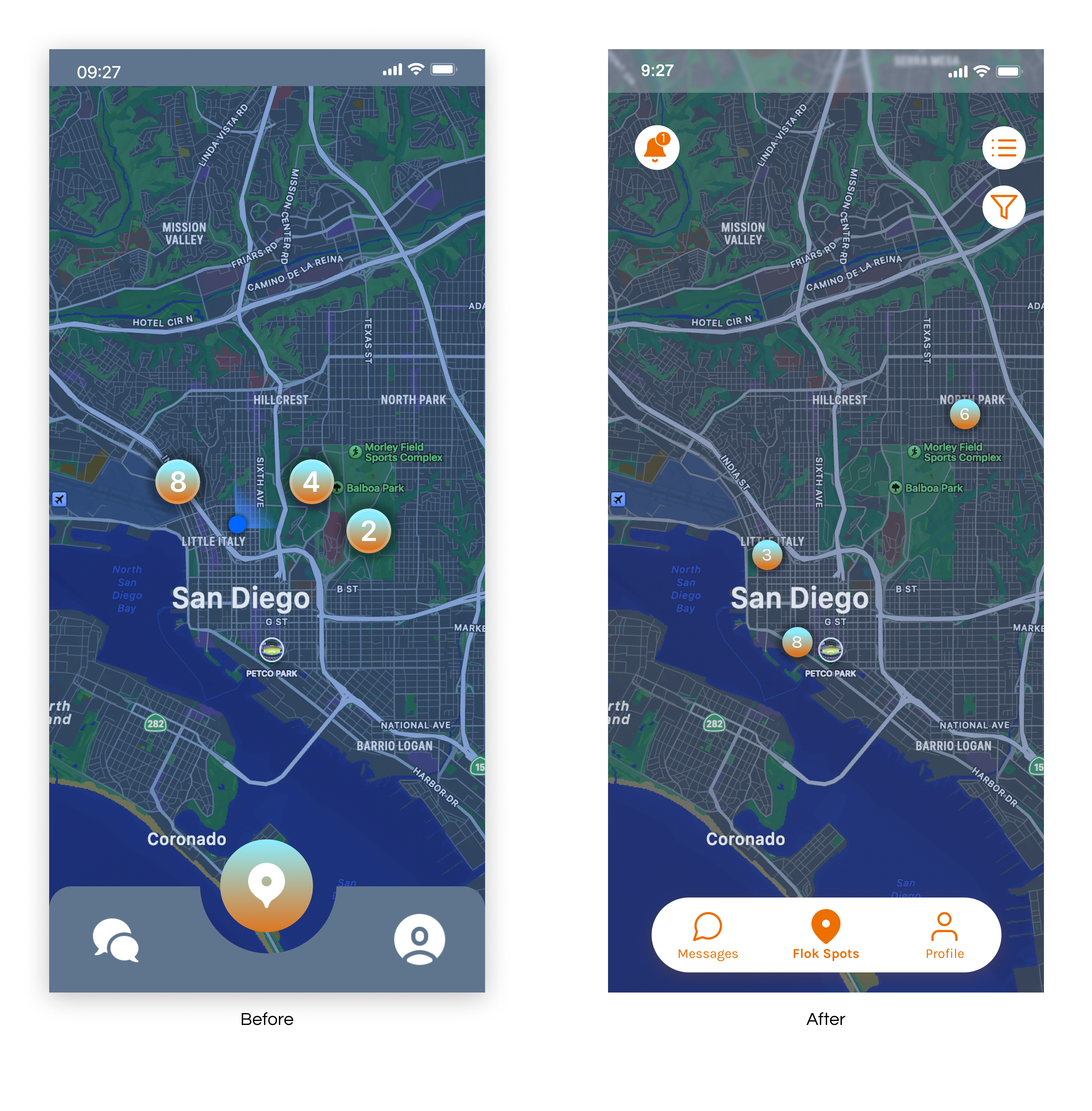
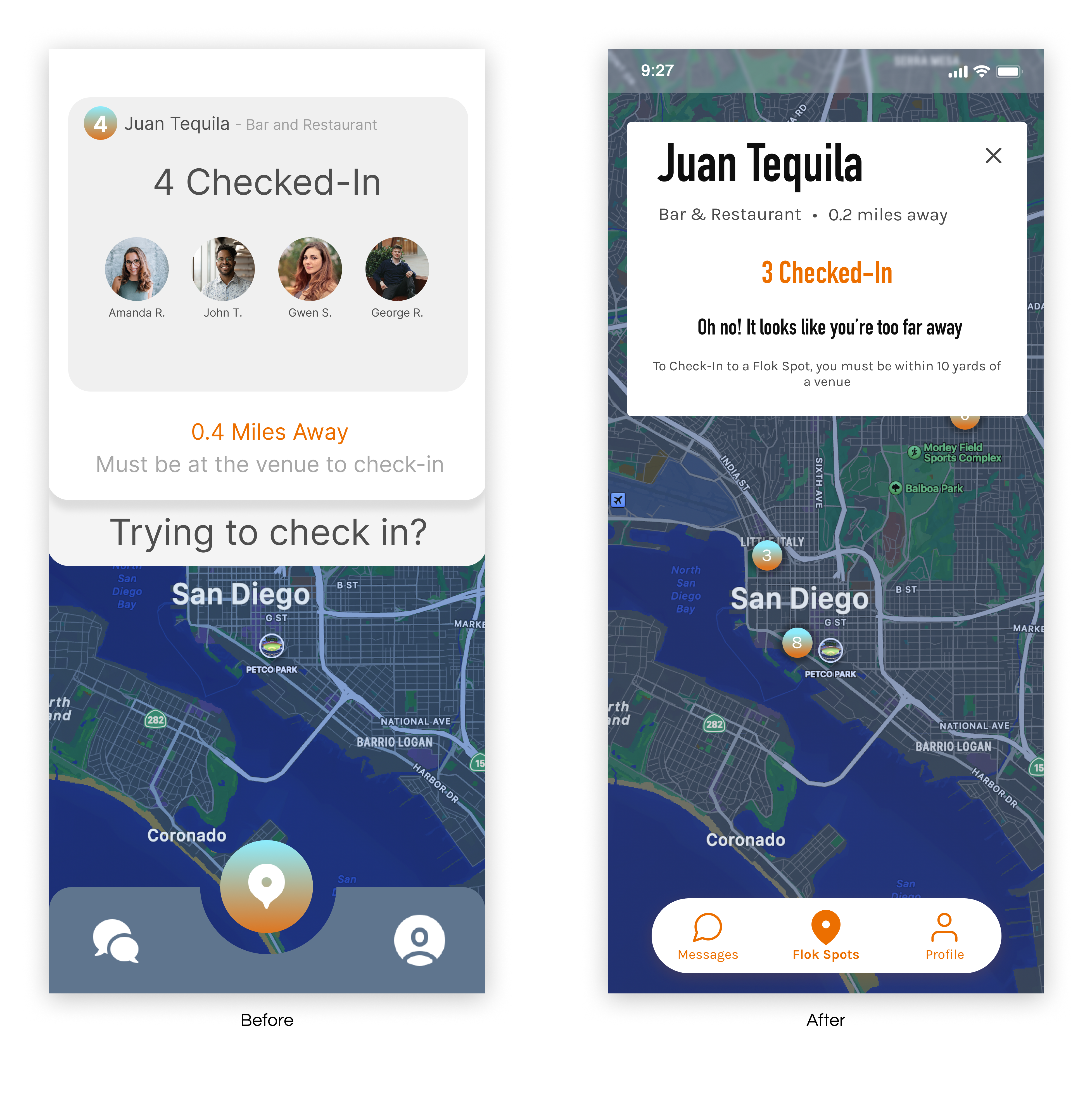
Checking-In
- Previous interface included excess, confusing information, while the new design streamlines flow removing unnecessary elements
- Easier to find exits for better user control
- Aligned colour palette with brand identity for more coherent and visually consistent experience
Too Far to Check-In
- Redesigned to protect user safety and privacy by only sharing info when needed
- Easier to find exits for better user control
- Provided concise instructions on how to complete check-in
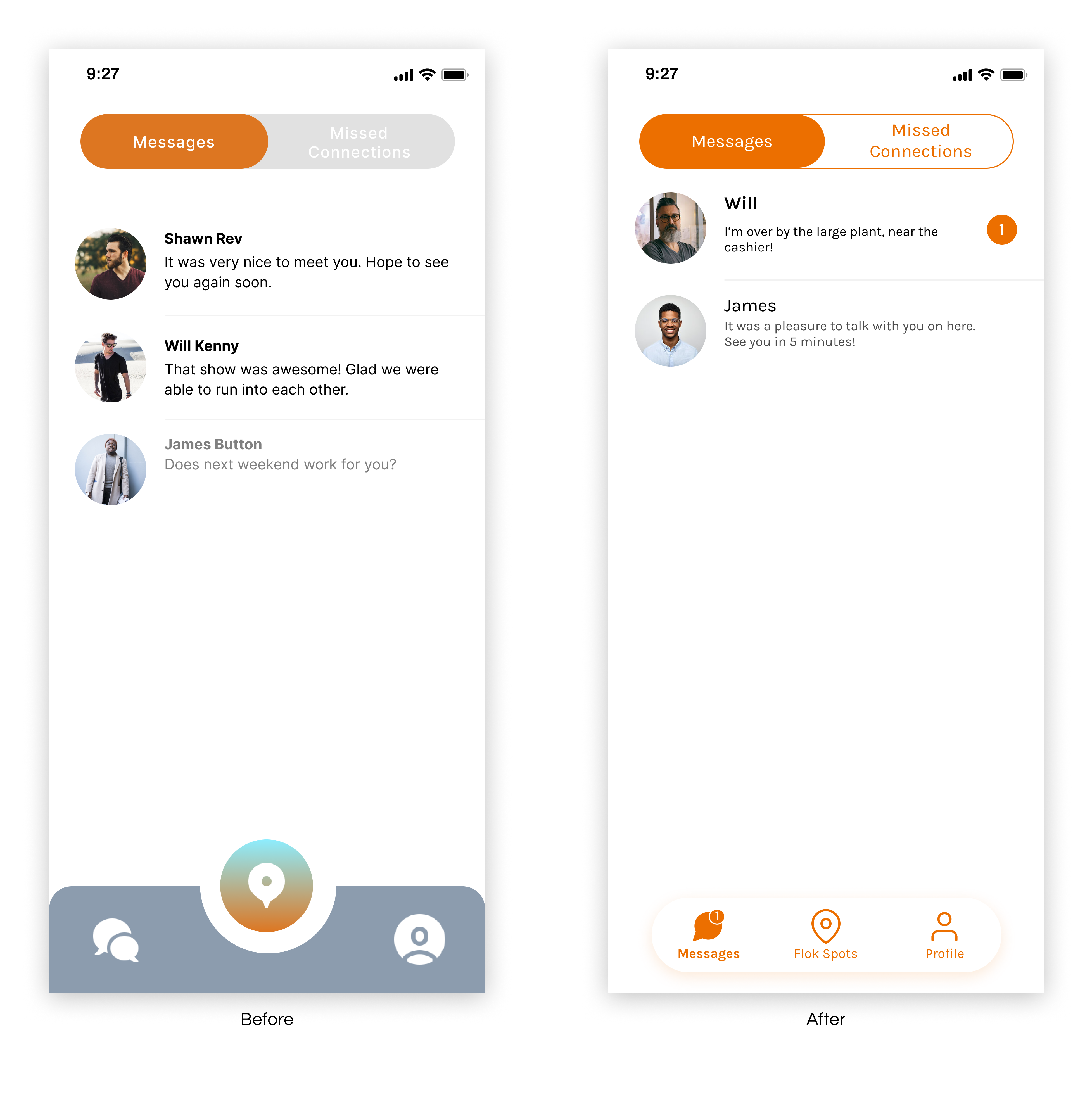
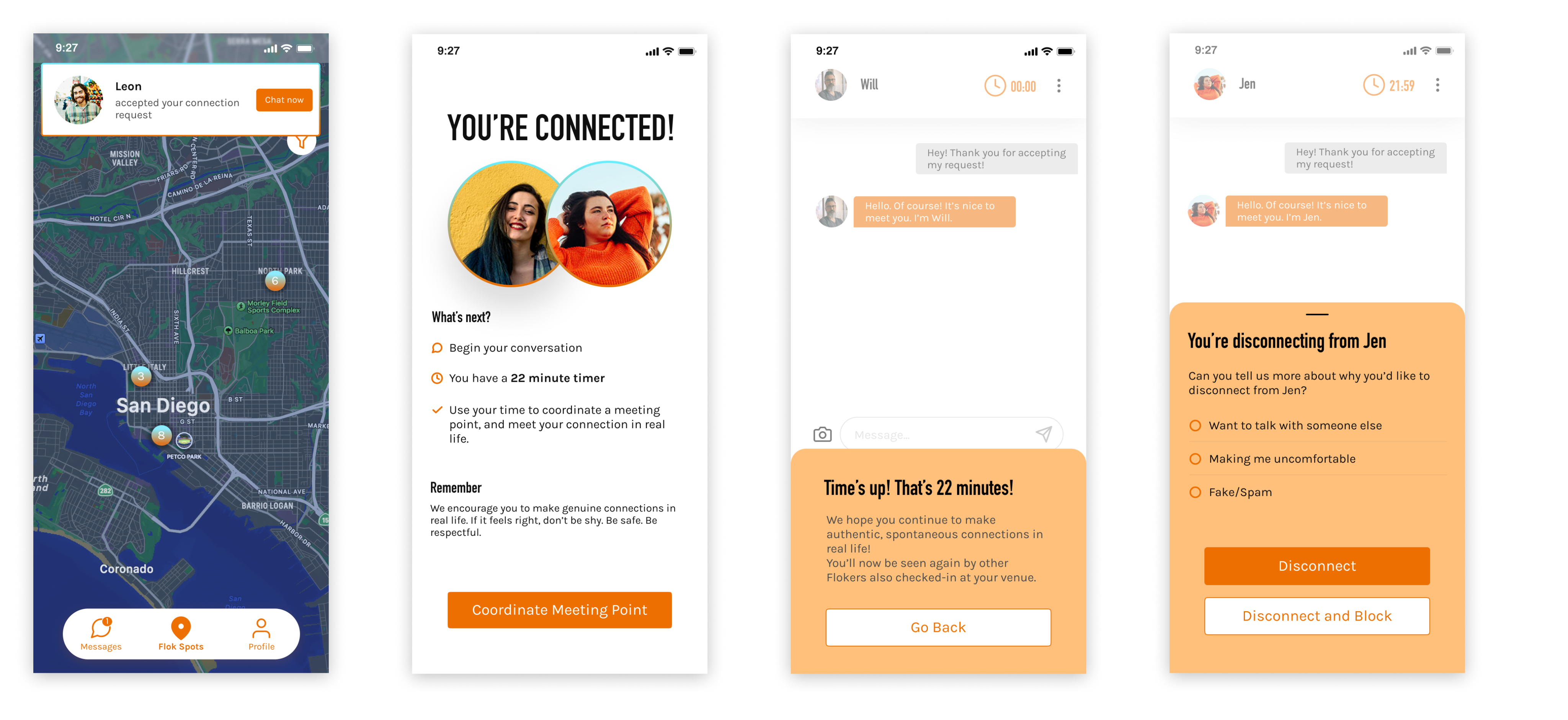
Messages
- Previous version had limited visual indication for users when they received a message
- Incorporated a message indicator on both the bottom navigation and unread messages.
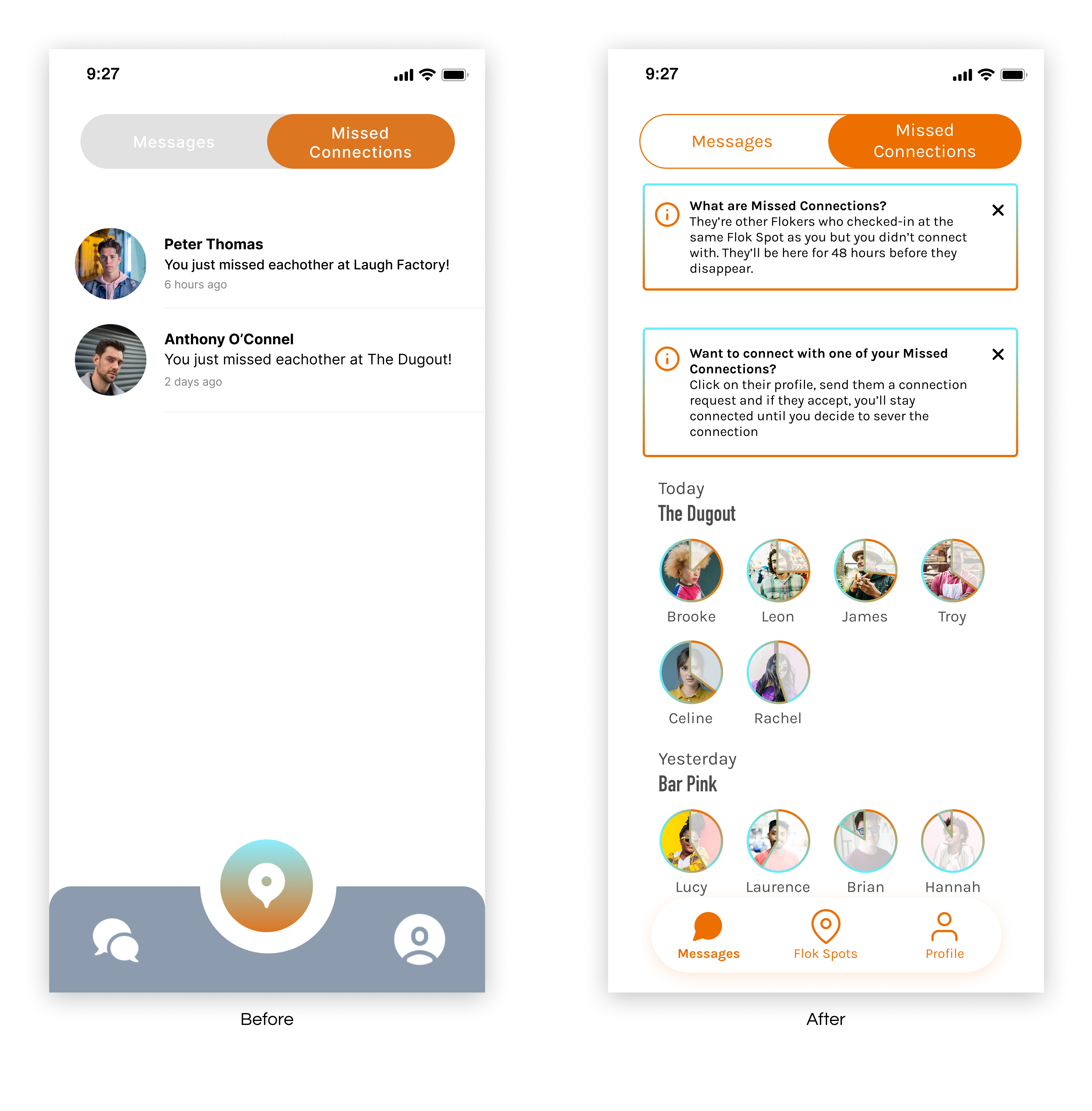
Missed Connections
- Missed Connections feature lets users connect with others those they missed for up to 48 hours after the event.
- Added a clock icon to profile images as a visual reminder to follow up
- Included information modules so users have all necessary details before sending a request
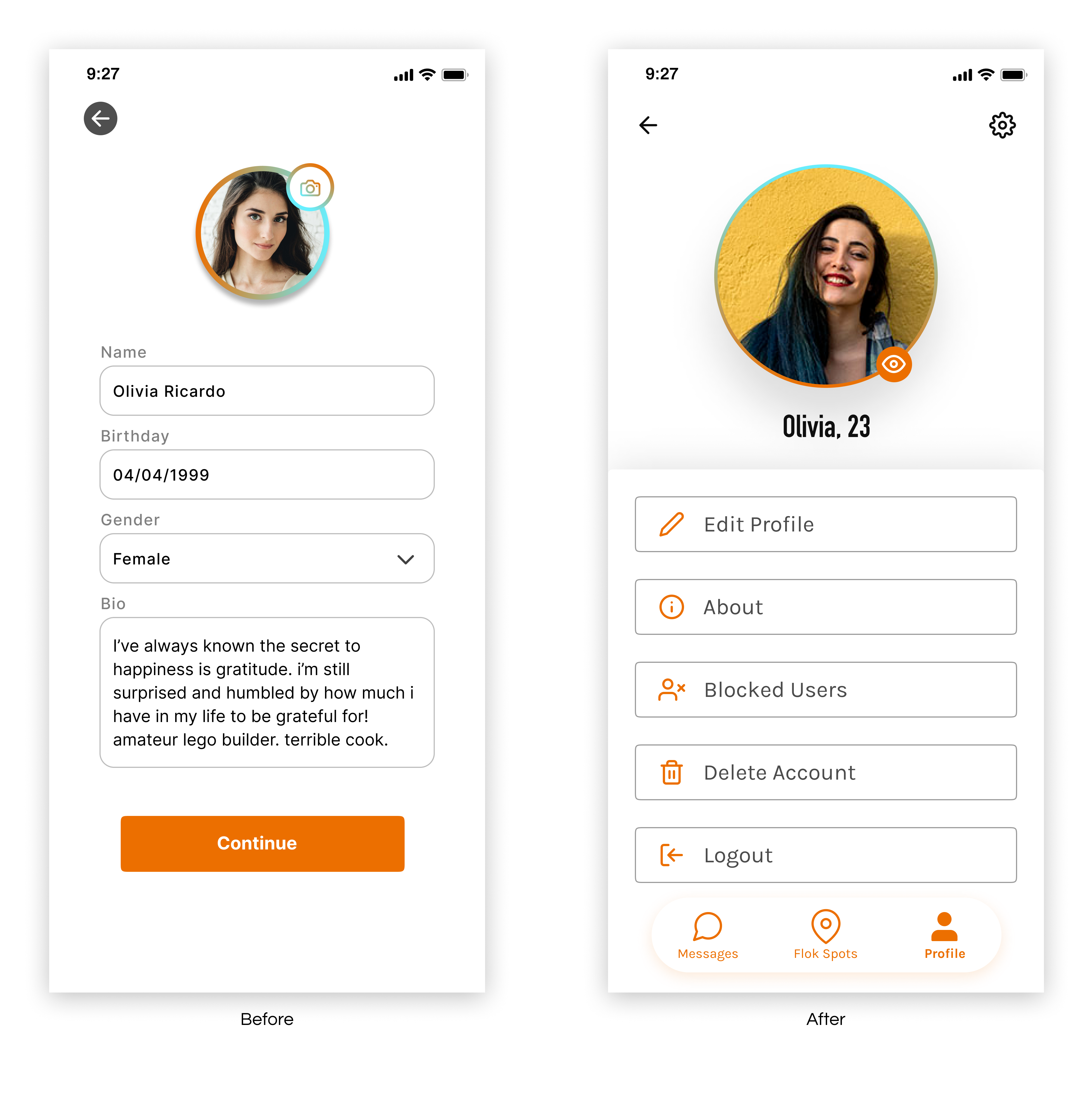
Profile
- Previous version had a confusing button and limited customisation
- More options for personalisation to enhance user engagement and support better connections
- Added a preview profile button so users can see their profile from others’ perspectives
Additional Screens
- Users now receive in-app notifications
- Added clear explanations when connecting with someone
- Included helpful reminders to encourage engagement
- Designed easy-to-use safety features
04 Testing & Iterating
Usability Tests
I created user flows that aligned with research findings and tested them with 5 participants across two scenarios. Overall the feedback was largely positive, it uncovered one major usability issue which informed the next round of iterations.
✅
“It similar to other apps I’ve used, there’s nothing surprising”
“It’s really simple”
🚨
4/5 testers expected connection requests to be located in the messages section.
🛠️
This led to merging notification centre into messaging. Including simplify the navigation and aligning with user expectations.
05 Reflection
As my first paid project, this redesign came with both excitement and moments of imposter syndrome.
I was able to stay engaged with stakeholders and successfully lead strategy sessions, I built up my confidence in my ability to guide the process and keep aligned with project goals.
I’m proud of how the redesign improved safety, usability, and aesthetics to better meet user needs and promote meaningful connections.
With the app now being rebuilt for launch, I look forward to seeing the impact of these changes and continuing to refine post-release.