Overview
SNKRS, Nike’s app for discovering, favouriting, and purchasing sneakers, also lets users track upcoming releases. This 4 day sprint was focused on creating a new feature that would add value and enhance user experience.
Role
Responsibilities
Tools
Year
UX/ UI Designer
Feature Design
Figma, FigJam
2022
🚨
Problem
SNKRS users could favourite and buy sneakers, but had no way to see what friends were saving or collecting. This limited discovery, created unnecessary friction, and kept sneaker collecting from feeling social or collaborative.
🎯
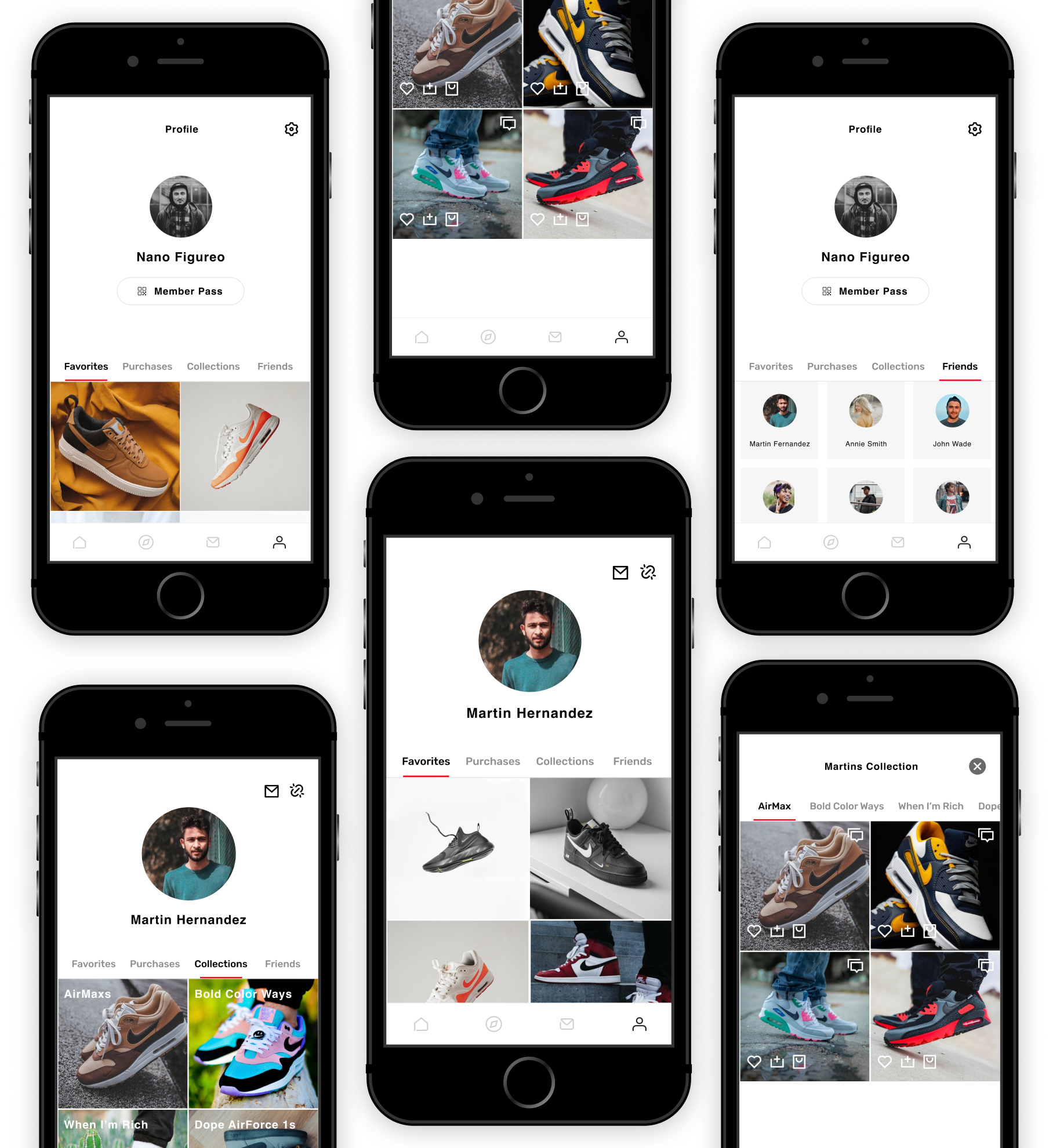
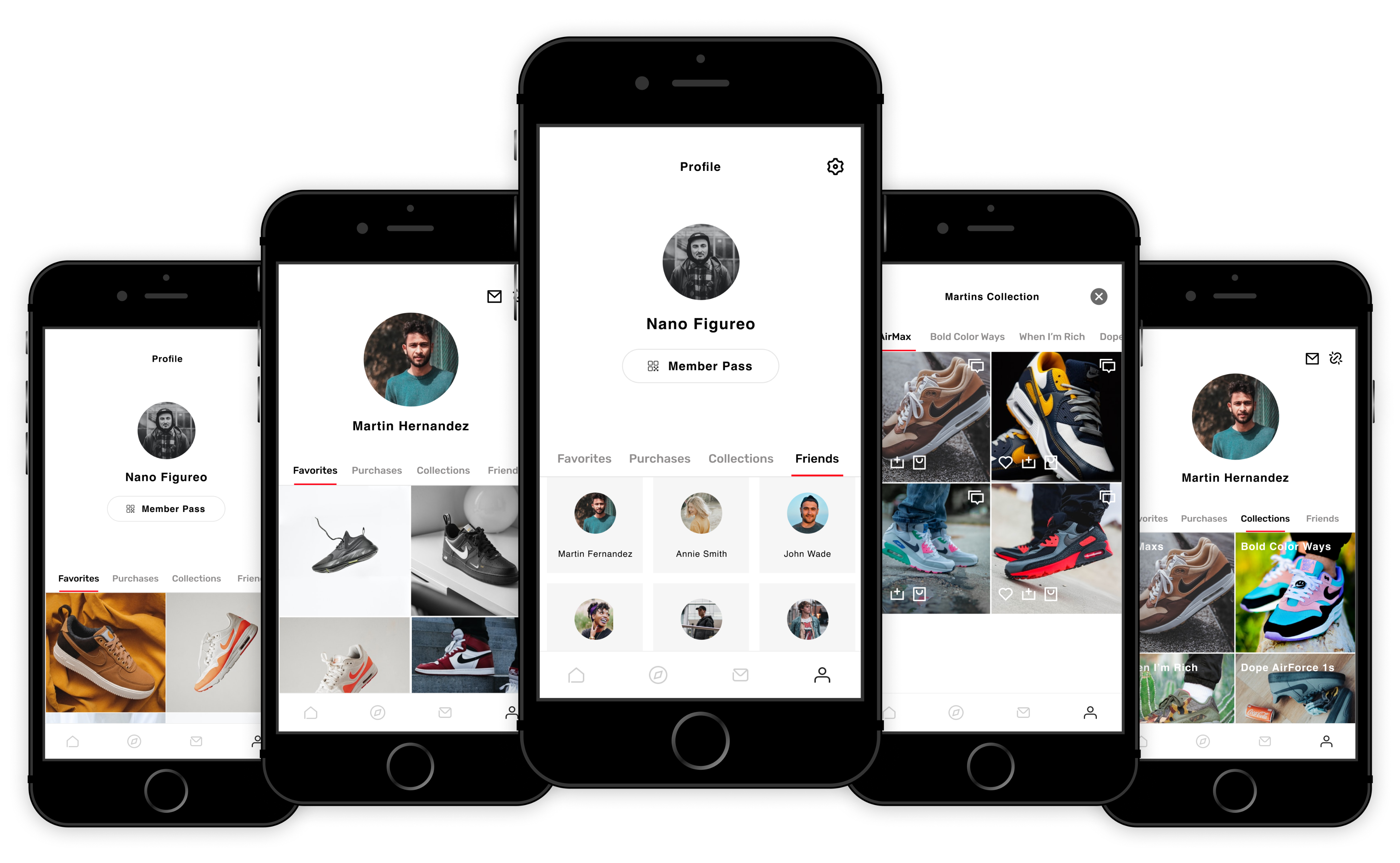
Solution
A Collections feature that allowed users to save sneakers into their personal profile and view their friends’ collections. Creating a more social, rewarding, and community-driven experience, that makes sneaker discovery easier and more fun.
🔄
Process
To understand user needs and barriers, I conducted a mixed-methods study that included competitive feature analysis, user interviews, affinity mapping, empathy mapping, and personas. Developing sketches, low-fi to hi-fi designs, testing and iterating based on usability test results.
01 Understanding
Research Goals
To stay aligned throughout this project I created research goals before starting this sprint.
👟
Understand how sneaker collectors discover new products
🔁
Explore the social aspects of collecting and sharing.
💬
Udnerstand expectations around usability and safety
Competitive Feature Analysis
Before conducting interviews, I completed a competitive feature analysis to understand what others do well, where SNKRS falls short, and which features could translate effectively into the app.
I researched 3 sneaker apps and 1 record-collecting app
📉
Shortcomings
- Sneaker apps only offered basic features: browsing, favouriting, and purchasing
- No options for collaboration, sharing, or discovery through friends
💡
Learnings
- Social features drive engagement in other collecting apps
- Viewing friends’ collections, adding directly from their lists, and writing reviews created more enjoyable experience
- Clear opportunity to stand out by making sneaker collecting social and collaborative
User Interviews
To better understand user needs, I conducted six interviews: four with avid sneaker collectors and two with casual fans. Speaking to both groups allowed me to compare how motivations and expectations differ, and how a new feature could serve each type of user.
- Participants included a mix of 6 male and female, between 21–32
- The interviews were 30–45 minute sessions via video call and were audio-recorded and transcribed
- The main focuses were understanding collector and casual user needs, discovery habits, and feature validation.
02 Analysis
Affinity Mapping & Insights
Sneaker discovery is hard, even for collectors.
Friends influence awareness and trends.
Users want to save time and avoid missing releases.
😓
Sneaker discovery is hard, even for collectors
👯
Friends influence awareness and trends
🕒
Users want to save time and avoid missing releases
Persona
Jobs to be done
Using this framework, I defined what users wanted to accomplish. This approach highlighted the functional, emotional, and social drivers behind their needs.
📉
Customer Job
Discover and collect sneakers easily, while staying up to date with trends and releases
💢
Pains
Discovery is difficult and time-consuming, without social features, they struggle to keep up and worry about missing drops
✅
Gains
They gain confidence in staying on top of releases, easier discovery through friends, while belonging in a sneaker community
📉
Job Hired
A Collections feature that allows users to save sneakers, view friends’ collections, and discover trends together
03 Design
Low-Fi
Explored adding ‘Collections’ to profiles, with early iterations including extra buttons and editing options that were later removed for simplicity.
Mid-Fi
Adjusted layouts to bring titles into pictures, removed unnecessary ‘See More’ and aligned with SNKRS patterns.
04 Testing & Iterating
Mid-Fi Usability Tests
5 tests with task: Add an item from a friend’s Collection to your own.
✅
“It’s pretty easy!”
🚨
4/5 testers found some labels and buttons unnecessary
🛠️
- Removed ‘See More’ button
- Made each collection tile clickable with embedded title
- Corrected user flow to reflect realistic actions and destinations
Hi-Fi Result
05 Reflection
When conducting my research I was getting very excited with all the possibilities this brief could lead! I tried to make the project bigger than the brief but it wasn’t realistic and I needed to rein it in. In the future I’ll need to remember to stick to the brief, understand my time constraints, and keep it simple!
Next Steps
🧪
Test hi-fi prototype with users.
🖲️
Prioritise button hierarchy (Favourite / Save / Bag / Interact).
💬
Add interactions like liking, commenting, and sharing items from friends’ Collections.